About
Who are we. What is this site.
PelhamWX.com is a site dedicated to "Hyperlocal" conditions and forecasting around the Southern New Hampshire location, specifically centered on Pelham, NH.
New England’s weather forecasting is notoriously challenging because the region acts as a battleground for three competing air masses: cold Arctic air from Canada, warm moisture from the Gulf of Mexico, and damp ocean air from the Atlantic. These systems converge over a compact region with complex terrain, ranging from coastal plains to the White and Green Mountains. Thus slight shifts in storm trajectory or elevation can cause dramatic weather variations across just a few miles.
Adding to this volatility is the Atlantic Ocean, where Nor'easters feed on the warm Gulf Stream and spring sea breezes can trigger rapid local temperature drops. Much of the region's weather develops over sparse areas like northern Canada or the oceans areas like Hudson Bay which both have less local weather data. This means weather models often struggle with initial precision and as a result, winter forecasts frequently hinge on a thin 1°F to 2°F margins. This makes differences such as rain or heavy snow unpredictable until the storm arrives.
Current Conditions
What the live map is showing
The live map pulls from real weather stations scattered around Pelham, not one official source. We combine mostly consumer station reports from Ambient Weather, Weather Underground, and a regional mesonet called Synoptic Data, so the map reflects what people's actual home stations are reading right now rather than a single averaged number for the whole town. Before anything gets plotted, each reading is checked against its neighbors. If one station reports something wildly out of line with everyone around it, usually a stuck sensor, it gets dropped instead of skewing the map.
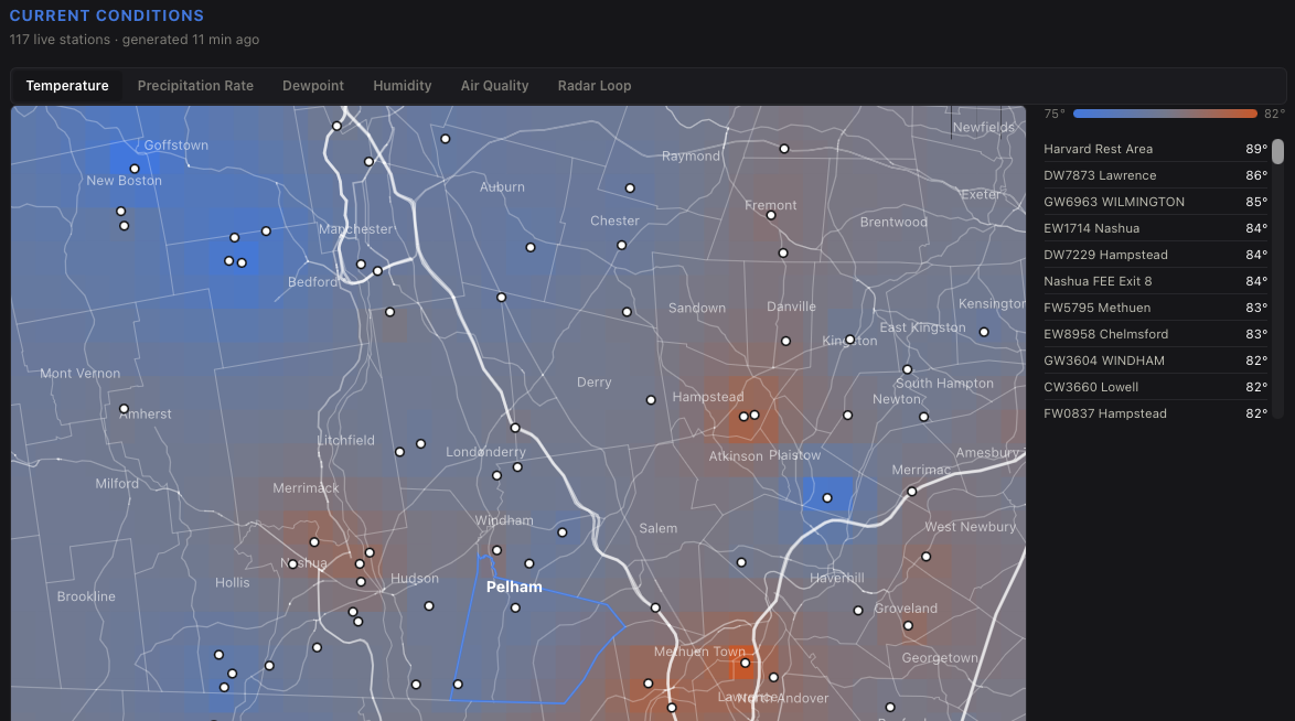
The Temperature, Precipitation Rate, Dewpoint, and Humidity tabs are all built the same way, live readings blended across the network. Air Quality works differently since it comes from PurpleAir's crowdsourced sensor network instead. Those sensors read high in humid weather if left uncorrected, so we apply a correction developed by EPA researchers before publishing a number, and we only use sensors reporting a high confidence reading. Radar Loop is NOAA's own precipitation radar product shown as is, updated every couple of minutes.
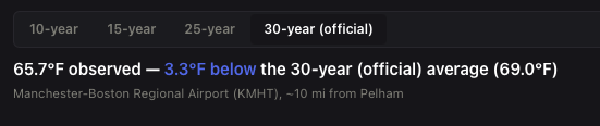
Lastly we include how current temperatures compare to averages over the last 10, 15, 25, and 30 year period.
Models and Forecasts
Hyperlocal, NOAA Baseline, and the calibrated forecast
Almost every weather app you use, including the built in one on your phone, is built on the same government model called HRRR. It updates every hour and covers the whole country, but each grid box is about 3 kilometers across, so it can't tell the difference between your yard and a neighborhood a couple miles away. NOAA Baseline on the Forecast Map is that model shown plainly, unchanged, so you can see what everyone else is really looking at.
Hyperlocal is our own model instead. We trained it on years of the Pelham station network's own weather and radar records so it learns how conditions here tend to differ from what the national model predicts, then it takes that same NOAA output and sharpens it down to roughly a kilometer. It is a real neural network, not a formula, and it is still young. It already beats the raw NOAA model on temperature, dewpoint, and humidity, but it still underestimates how intense a storm's heaviest rain can get, especially in fast moving summer thunderstorms.
The day ahead forecast further down the page works differently again. Instead of downscaling a map, it corrects a single point forecast using a year of the Pelham station's own history, learning where NOAA's model tends to run warm, cold, or dry here specifically and adjusting for it before publishing. It also watches its own recent misses and nudges itself based on how the last few days actually went, and the chart shows raw HRRR right alongside it so you can see exactly how much the correction is doing. Hyperlocal and NOAA Baseline both update every hour and run 48 hours out. The day ahead forecast updates every hour as well. None of these are finished products. We would rather show you an honest, improving forecast than pretend it is perfect.
The Current Forecast card up top works the same honest way. The 3 hour rain window comes straight from live radar rather than a forecast model, it looks at how rain is currently moving and projects that motion forward a few hours, so it reflects exactly what is happening right now rather than any local adjustment. The short written forecast below it blends this project's own numbers for the next several hours with what the National Weather Service is saying about the wider region, so something like an approaching coastal storm shows up in the wording even when it is outside what a purely local model would ever catch on its own. Extended Forecast, the week of day and night cards further down, is real National Weather Service data shown as is, not something this project calculates.
The site also watches for things separately from the maps and models. Active watches and warnings for this area come straight from the National Weather Service and refresh every few minutes. We add one alert of our own on top of that, a black ice advisory that fires when wet roads look likely to refreeze overnight, since NWS doesn't have a specific product for that exact situation. River flooding works the same way, live rather than historical. Nearby rivers with an official NWS flood stage are checked against that real threshold, and smaller streams that never had one set are compared against the highest level ever recorded there instead, so nothing gets a made up risk category.
Historical Data
What's on the Historicals page
The Historicals page is where every archive this project keeps lives. Temperature and precipitation history come straight from the station network described above. Streamflow comes from real USGS river and stream gauges near Pelham. Air quality history comes from the same PurpleAir sensors as the live map. UV history comes from the Pelham station's own sensor. Forecast skill is the forecast itself graded continuously against what actually happened, not a claim we make once and leave alone.
A few of these comparisons are worth knowing about specifically. Precipitation gets checked two ways at once, what the rain gauge here actually caught against what NOAA's own radar estimated fell in the same spot, since a gauge alone misses a lot of snow. And because rainfall in this region can vary enormously over just a few miles, we also show how much of the wettest nearby storm actually reached Pelham rather than assuming every town nearby got the same amount. River gauges get similar honest treatment. The bigger rivers nearby have official flood stages set by the National Weather Service, so those are shown against that real threshold. Smaller streams like Beaver Brook never had a threshold set since they are considered too small, so instead we show today's level against the highest level ever logged in our records (May 15, 2006).
Most of these archives are still young. Some started within the last year, so early trends should be read as a start, not a settled pattern. The longer this runs the more useful it gets.
Features
Missing?
Something missing you want to see? Drop us a note and lets see if we can add it!